Appearance
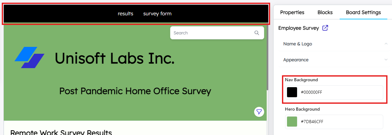
Nav background
This setting controls the background color of the navigation bar, which is typically located at the top of the board. A well-chosen background color helps improve readability and navigability, ensuring that important menu options stand out.
Hero background
This setting changes the background color of the hero section. The hero section is a prominent visual area at the top of your board, often featuring key messages, images, or titles that introduce the content. The background color here should complement the hero’s text and imagery to create a visually appealing and impactful introduction to the board.

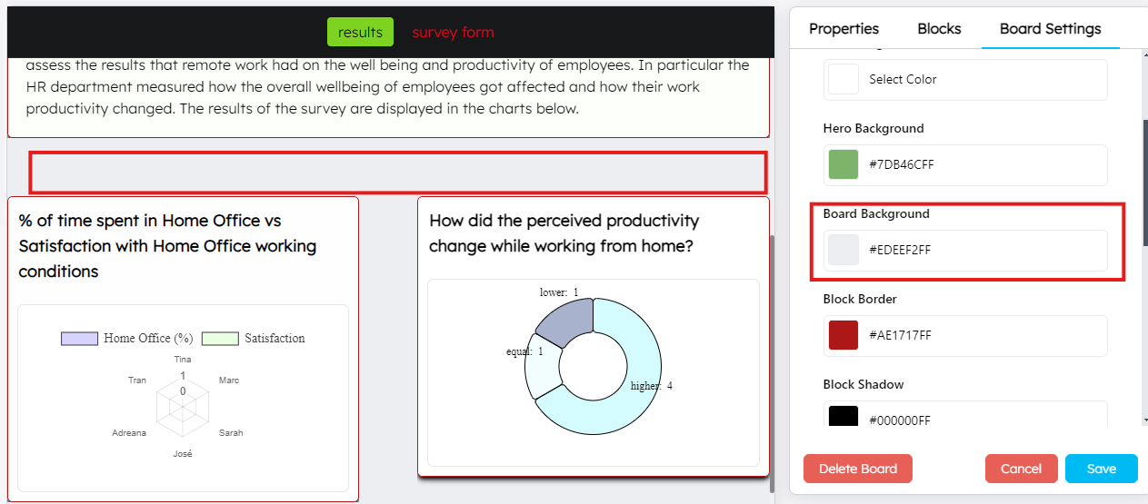
Board background
This is the background color applied to the entire board or workspace. A solid, consistent background color helps frame the content and can affect the board’s overall readability and user experience.
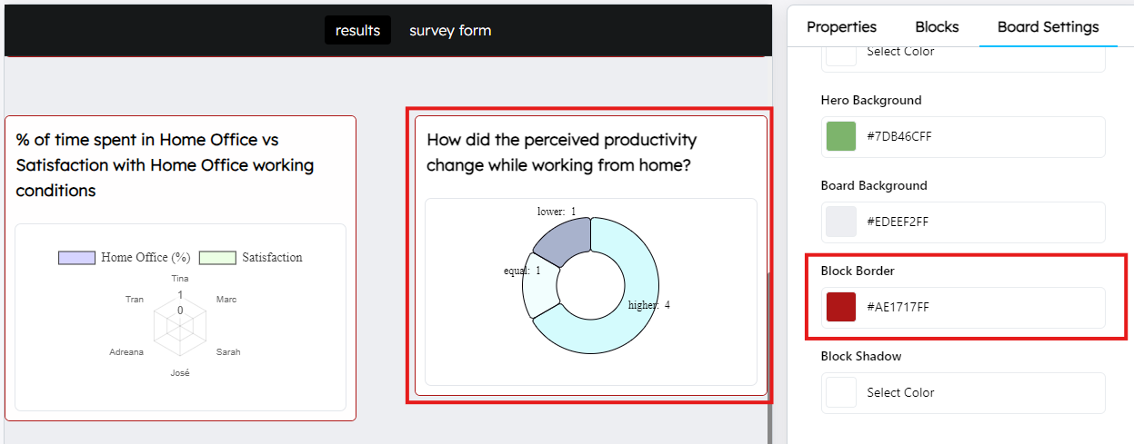
Block border
This setting controls the border color of individual blocks or sections within the board. Block borders are used to visually separate content, adding structure to the layout, making it easier for users to navigate through different sections.
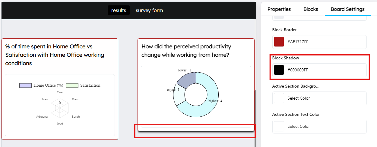
Block shadow
The shadow setting adds depth to blocks, making them appear raised or three-dimensional. Shadows can enhance the visual hierarchy of elements and make blocks stand out from the background, giving the board a polished and professional look.
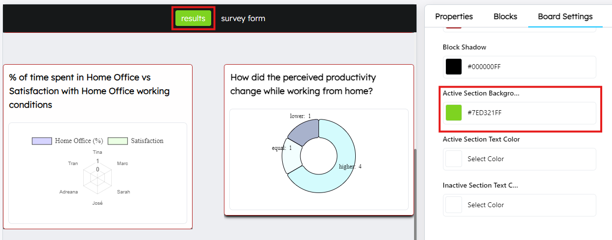
Active section background
This setting defines the background color for sections that are currently active or selected. Highlighting active sections helps users understand which part of the board they are interacting with, improving overall navigation and usability.
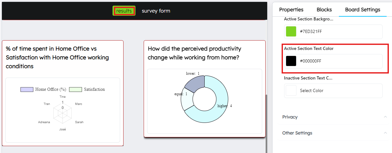
Active section text color
This setting specifies the color of the text in the active section. The contrast between the text and background color should be optimized for readability, ensuring that users can easily understand the content in the active sections.
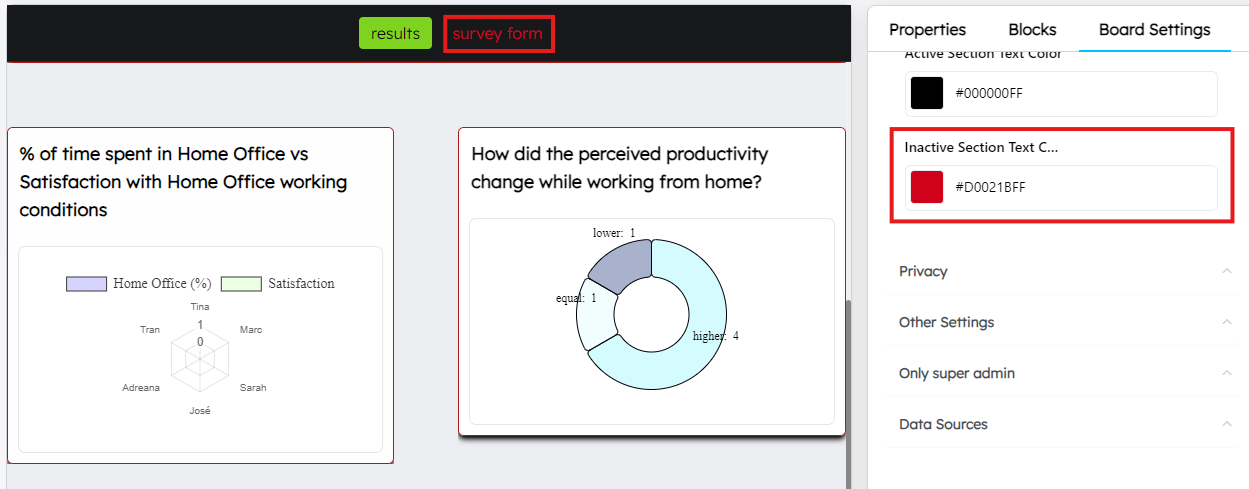
Inactive section text color
This controls the color of the text in inactive sections, or sections that are not currently selected. Distinguishing between active and inactive text helps guide users’ attention and clearly shows them where they are within the board.
