Understanding HTML in Hero Sections
A Hero section is a prominent area on a webpage, typically featuring large images or bold text, designed to grab attention and convey key information. Using HTML (HyperText Markup Language), we can structure this section with headings, images, and custom styles to enhance its visual appeal. By using basic HTML tags and CSS styling (inline or in separate stylesheets), you can achieve a fully customized look for the hero section.
Below are three examples that illustrate how to use HTML to create custom hero sections:
Here’s a brief explanation of how HTML can be used to create customized hero sections with different scenarios and the code samples provided:
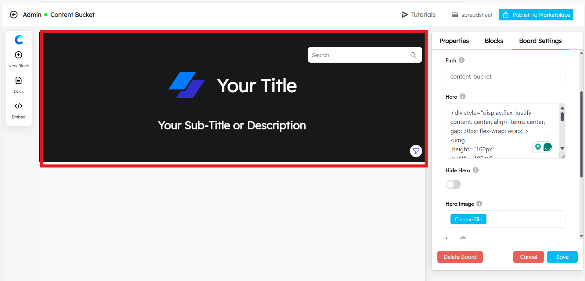
Scenario 1: Centered Content with Flexbox
This code creates a hero section where the image and title are centered, both vertically and horizontally, with a flexible layout that adjusts the content spacing and alignment based on the screen size.
<div style="display:flex; justify-content: center; align-items: center; gap: 30px; flex-wrap: wrap;">
<img
 height="100px"
 width="100px"
 src="https://www.chartmat.com/template-images/img/logo5.svg"
/>
<h1 style="text-align: center; color: white;">Your Title</h1>
</div>

<div style="align-items: center; text-align: center; gap: 40px; margin-top: 50px;">
   <h3 style="color: white;">Your Sub-Title or Description</h3>
</div>

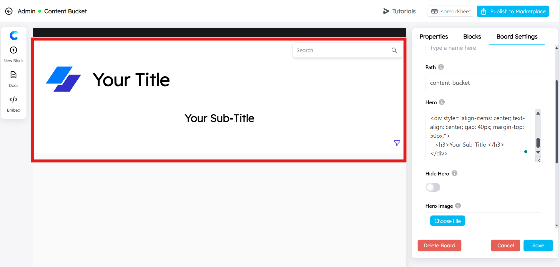
Scenario 2: Simplified Centered Layout
This scenario simplifies the layout with aligned elements and minimal styling but still creates a centered visual appearance. The title and description are stacked under the logo.
<div style="display:flex; align-items: center; gap: 30px; flex-wrap: wrap;">
<img
 height="100px"
 width="100px"
 src="https://www.chartmat.com/template-images/img/logo5.svg"
/>
<h1>Your Title</h1>
</div>

<div style="align-items: center; text-align: center; gap: 40px; margin-top: 50px;">
   <h3>Your Sub-Title </h3>
</div>

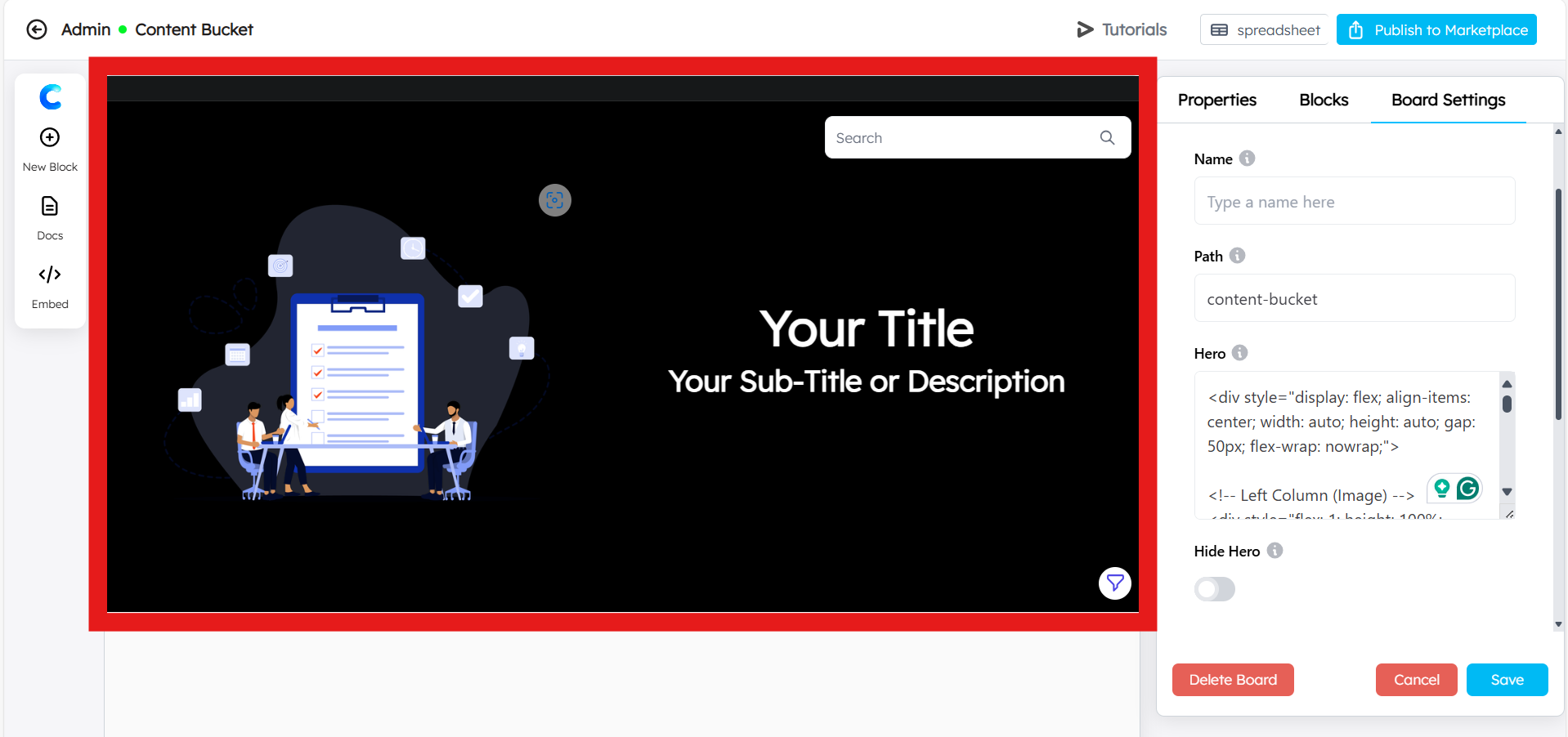
Scenario 3: Two-Column Layout with Image and Text
In this example, the layout is divided into two columns, one for the image and the other for the text. The image takes up 50% of the space, while the text content is vertically centered in the other half.
<div style="display: flex; align-items: center; width: auto; height: auto; gap: 50px; flex-wrap: nowrap;">

<!-- Left Column (Image) -->
<div style="flex: 1; height: 100%; background-color: black;">
<a href="https://ibb.co/HG6W0h1">
<img src="https://i.ibb.co/WBZbQVq/Banner-Hero-Image.png"
 alt="Banner-Hero-Image"
 style="width: 100%; height: 100%; object-fit: cover;"
/>
</a>
</div>

<!-- Right Column (Text) -->
<div style="flex: 1; padding: 20px; display: flex; flex-direction: column; justify-content: center; align-items: center;">
<h1 style="text-align: center; color: white;">Your Title</h1>
<div style="margin-top: 20px; text-align: center;">
<h3 style="color: white;">Your Sub-Title or Description</h3>
</div>
</div>
</div>

This is just a sample HTML to create an attractive hero section. Feel free to take your time and build your own HTML code based on your unique ideas and requirements. The structure and styling can be adjusted as per your preferences to fit your website’s design and functionality perfectly.